As with the rest of the running of Clapton CFC, our programmes are created by hard-working volunteers who must have had nothing better to do with their time, given the hours they put in.
When CCFC was formed in February there was a lot to do. from the key foundations of membership and finances, to players, a home ground and even a club name.
After that the Comms team needed to create a badge, kits, website and social media accounts for the obvious practical purposes of a non-league football club.
In fact, it wasn’t until the first set of pre-season fixtures were added to the calendar that Comms started to think about the programme.
Step forward new CCFC member and AcidFC.com head honcho Ed to take the lead on putting the programme together.
We are extremely lucky to have on our Comms team some unbelievably talented, giving and patient designers, writers, photographers and logistical superheroes to help make this magazine possible.
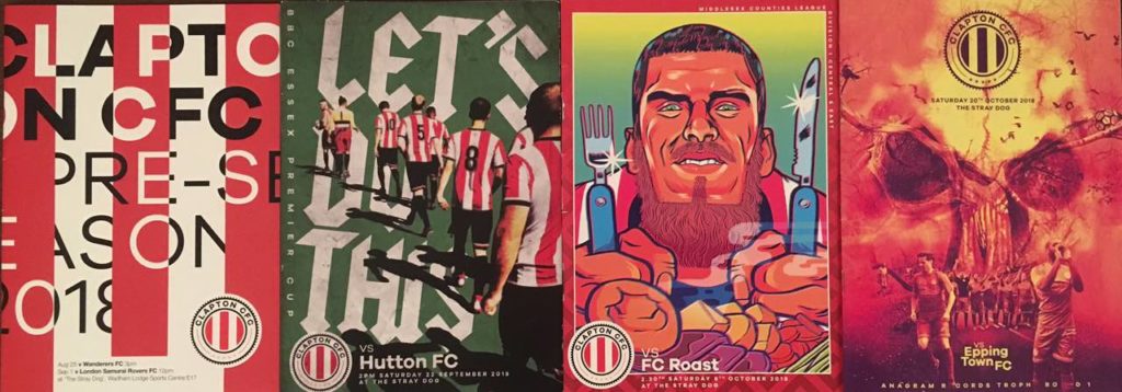
We also put a call out for artists/designers/illustrators to design one-off programme covers each and the response has been amazing already.
We caught up with Ed to find out what it takes to keep the programme wheels greased…
What made you offer to design the programme?
I think that’s true of all the volunteers involved with Clapton CFC – we are very like-minded people and you make friends very quickly around here.
If anyone reading this is considering diving in and volunteering for a committee, then I’d say don’t hesitate.
Secondly, I’ve been wanting to design for football since I was about 13. It’s actually my earliest design memory, designing football kits from a template from Shoot! magazine in about 1991. It started an obsession with graphic design and sports.
Surprisingly it’s only in the last year that I’ve actually got properly into football and design as a personal project outside my day-job.
Football programmes have always fascinated me from a design perspective as generally they were always terrible.
Always filled with as many design effects as possible from the latest version of Quark Express or Photoshop – all drop shadows and 3D type.
I think that has remained the case even to this day and even at the largest clubs in the world. I can only see in the last couple of seasons a handful of clubs starting to use quality illustrators and designers to do something that looks good and ultimately helps sell a club’s brand.
Look at what the Art of Football have done with Nottingham Forest or Patterns of Play with Norwich City.
These clubs have such rich history and fans that follow them through thick and thin. The least they can do is give them a decent magazine.
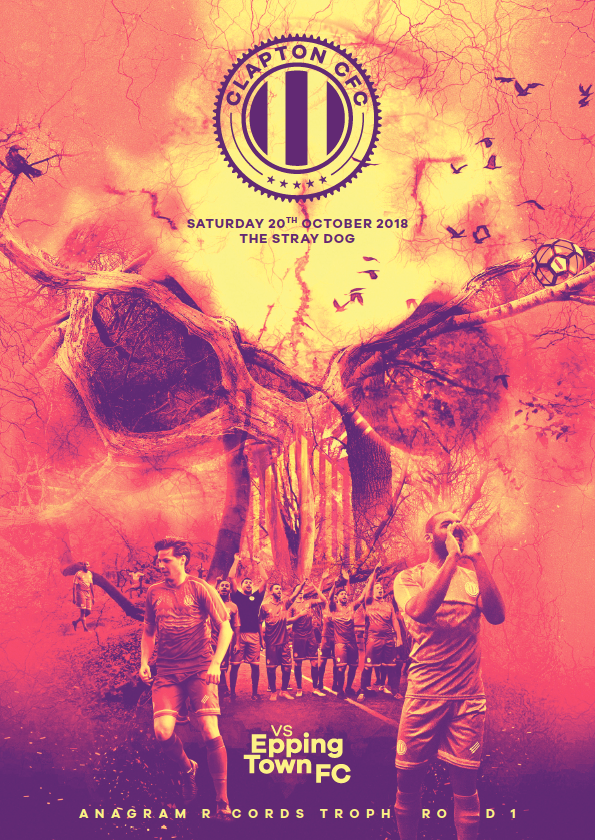
A quick peek of our special edition programme for tomorrow’s game with @wanderersafc pic.twitter.com/IC9AfBLcs7
— Clapton CFC (@ClaptonCFC) August 24, 2018
Is the rise of fanzines anything to do with it?
Absolutely. There are some incredibly well produced football fanzines out there like The Square Ball (Leeds United) or The Gooner (Arsenal) that thrive from the fact that they don’t have access to official photography so have to use illustrators. And I think they all to often have a better eye for being able to represent how the fans see the club.
It’s interesting that Arsenal are now doing a completely different cover style for each programme this season based on a particular bygone era.
Why did you decide to offer the cover design out to different artists for each issue?
It was a couple of things, really. Firstly, I love collaborating but I wanted fans to not know what to expect from the next programme. Give them a reason to get to games and grab a copy.
Also I thought it was a good way to tell more people about CCFC as the artists would share their covers through Instagram.
So far we are only a handful of games into the season but the standard is astonishingly high and I’ve a big waiting list.
Don’t let that put off any other artists out there, get in touch and be a part of the CCFC story. We’re not going anywhere.
So how have you got the Clapton ethos into the programme design?
Aside from the club badge, a couple of typefaces and the website, there is no official brand guidelines to follow.
In an ideal universe, where I have loads of time, each programme would be done like a proper DIY punk fanzine – all photocopy textures and cut out text. But I would have had to quit my job to find time to do it.
So instead I went about looking for socialist typefaces… as you do. There’s a brilliant book called In Loving Memory of Work – A visual record of the UK Miners’ Strike 1984-85 by Craig Oldham that contains three beautiful bespoke fonts created from demonstration placards, sewn banners and so on.
Craig was happy for CCFC to use them. You can download the fonts here and payments go to the Orgreave Truth and Justice Campaign which includes ex-miners, trades unionists, activists and others who are determined to get justice for miners who were victims of police lies and cover ups at Orgreave in June 1984.
These typefaces for titles and some classic modernism layout, with black and white photos to keep print costs down, gives us a punchy programme with plenty of attitude and a dash of punky flair…I think.
Football League clubs this year voted to make a match programme an option rather than a requirement. How do you feel about that and what would you say to clubs considering ditching a programme?
I was lucky enough to ask a similar question to fellow designer and programme aficionado Matt Caldwell, who runs the brilliant Instagram account @1_Shilling about the history of football programmes.
He mentioned how important it is to create something that makes the fans feel part of a cult. To establish a design which will connect with the fans on an aesthetic level.
I think this quote from Matt sums it up perfectly
The grit of non-league football is what makes it so special.
The freedom to walk around the pitch whilst drinking a pint of ale and being in sweating range of the players reflects how the football experience used to be, and what better way to capture this feeling of rawness, passion and energy than a passionately crafted, tactile object. (No, not a mobile phone).
A programme reminds a spectator about where they are, channelling all their attention to what is happening between a stadium’s walls. A phone is a constant reminder of the troubles you leave behind when pushing through a turnstile.
Keep the moment special, and celebrate it with something that won’t get lost in your instagram feed, but in your loft. Because one day you’ll see that beer-stained, dust gathered stapled pieces of paper and think back to that rainy comeback in East London. You might even say it’s become a design classic.
What tips do you have to offer other clubs or designers?
1. Chase the articles
Without them, there’s nothing and you can’t plan.
Work out how many pages you are working with and remember that magazines are made from four pages per sheet so always have to divide by four. Mock it out with a pen so you know where everything will go.
Only then start building content and have a reason for every aspect of the content before you start – fonts, picture style, standard layout templates and so on. Don’t get into adding effects or flourishes. If there’s no need for something from a narrative point of view, then take it out. It helps get the content in should already give the programme a pretty solid look.
2. Read the articles
It’s amazing how many designers don’t bother. There’s no excuse if you are working for the club you support! Not only does it give you valuable insight into your club but it helps you be able to pull out and highlight key phrases like a pro. Plus it will probably help you decide which photo makes the most sense to go with the article and what size it should be.
3. Create templates
Create very clear templates with flexible grid systems and don’t move from them for the season – it makes putting the programme together much easier and also means that should you be indisposed then someone else can pick up the baton and make it look almost the same style as the others.
4. Printer
Find a reliable printer who can work on tight deadlines and quick turnarounds.
Get involved
If you want to try your hand and design a cover, email us at comms@claptoncfc.co.uk or through our social media channels. We’ll get in touch and give you access to a load of assets so you can go wild.
If design isn’t your thing but want to contribute with the articles, views, photography, illustration, recipes, tips or interpretive modern dance, drop us an email and we’ll put you in touch with the “Matchday Magazine” team.
Is there a plan to make downloadable versions available for those of us treehuggers who try to be paperless and for our many members and supporters in far away places?
Working on it in these days!
The art work has been outstanding in each programme and the content isn’t to shabby either.
I don’t think I’ve seen programme covers with such an original take on the game or our opponents.
Look forward to more of the same.